To balance the game more nicely, and to not receive so many shields so fast, I'll add a Drop Rate Mechanic to the Random Item Mechanic. This has been a point made, where getting a lot of Fake Item Generators is not too fun.
The AI is also too busy "making out" from time to time, and dealing with that is going to be a bit of a hassle but not impossible at least! :)
Anyway, to give my head a fresh take on different aspects of the game, I decided to rework the visuals of the Main Menu.
I wanted to keep a motif throughout the game. I came up with a very nice motif for Mayhem Arena, which also reoccurs in Lunatinc's logo :)
I then took this shape, and try to visualise an image to what the players are welcomed in the Main Menu.
I sketched this design:
I really like how this turned out. It looks like the Singleplayer button and the Multiplayer button look like they can fit into one another, so that gave me an idea for something later as well. :)
First off, the Singleplayer button.
Normal
Hovered
Pressed
I really like the look of this button. I also received some nice feedback on these buttons on a personal level, saying that the use of this motif is really nice.
The same feedback was made over the Multiplayer button.
Normal
Hovered
Pressed
The ones that I showed these buttons could already make out which button is for single player, and which one for multiplayer. It is very simple really, as I can expect that you would have guessed without me already saying what it was. :P
Normal
Hovered
Pressed
Yeah. This is the Exit button! Good guess :)
Normal
Hovered
Pressed
I really like how these turned out. I'm not too handy with Illustrator and Photoshop, but I do have some general knowledge. Plus, YouTube is a great source of tutorials :)
This button here is the new Settings button.
If you have ever made a widget in Unreal Engine, you'd probably wondering how this will look when I add this to a normal button. I actually came across something called the Ovodus Button, which was made into a plugin for Unreal. This button takes in a texture which it uses to see if the mouse is overlapping the image or not. Meaning, for example, if the mouse hovered over the motif-hole in the Settings button and then clicked, it wouldn't register. Very neat!
Now to test it.
It looks nicely in here.
I've anchored all the buttons in the middle of the screen. This is for what I have planned with this part of the menu.
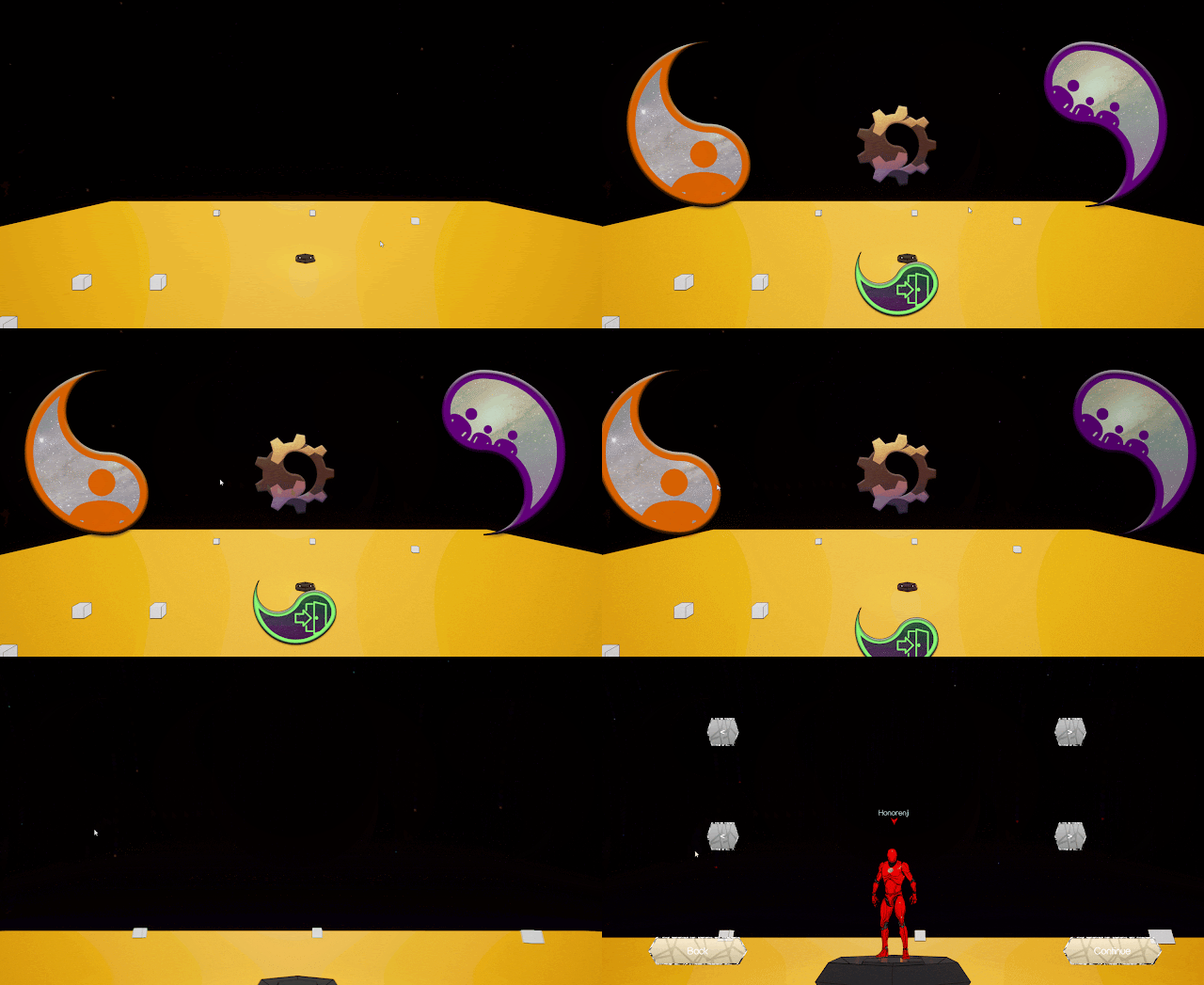
This is what I have made so far. The background is of course up for a lot more than this. Also, the cubes do have a purpose! They were just put there so I can see how the depth is affected by all the menu transitions.
Lastly, the menu animation.
That's all to share for now!


No comments:
Post a Comment